
Typeset, a design skill for AI agents, and 21 new components
Three weeks ago I wrote up a month of Petal Components releases. Since then we've shipped the two things I most wanted to build this year, and the biggest single release the library has ever had. The playground also has a public home now at playground.petal.build, so everything below is something you can click, not just look at.
Typeset
Petal Components has always let you dial in your colours and your corner radius. Fonts were the gap. Every app has a typeface it wants to be, and until now the library just inherited whatever the page happened to have, with no way to say headings in this, body in that, code in the other.
Typeset closes that with three CSS custom properties: --pc-font-heading, --pc-font-body and --pc-font-mono. The rule that made it work is the same one we use for radius: the library reads them but never defines them. Set none and every component keeps your app's existing stack, byte for byte. Set one and the surfaces that should follow it do, in light and dark, with no Elixir config and no build step. Heading falls back through body, so one token can restyle everything.
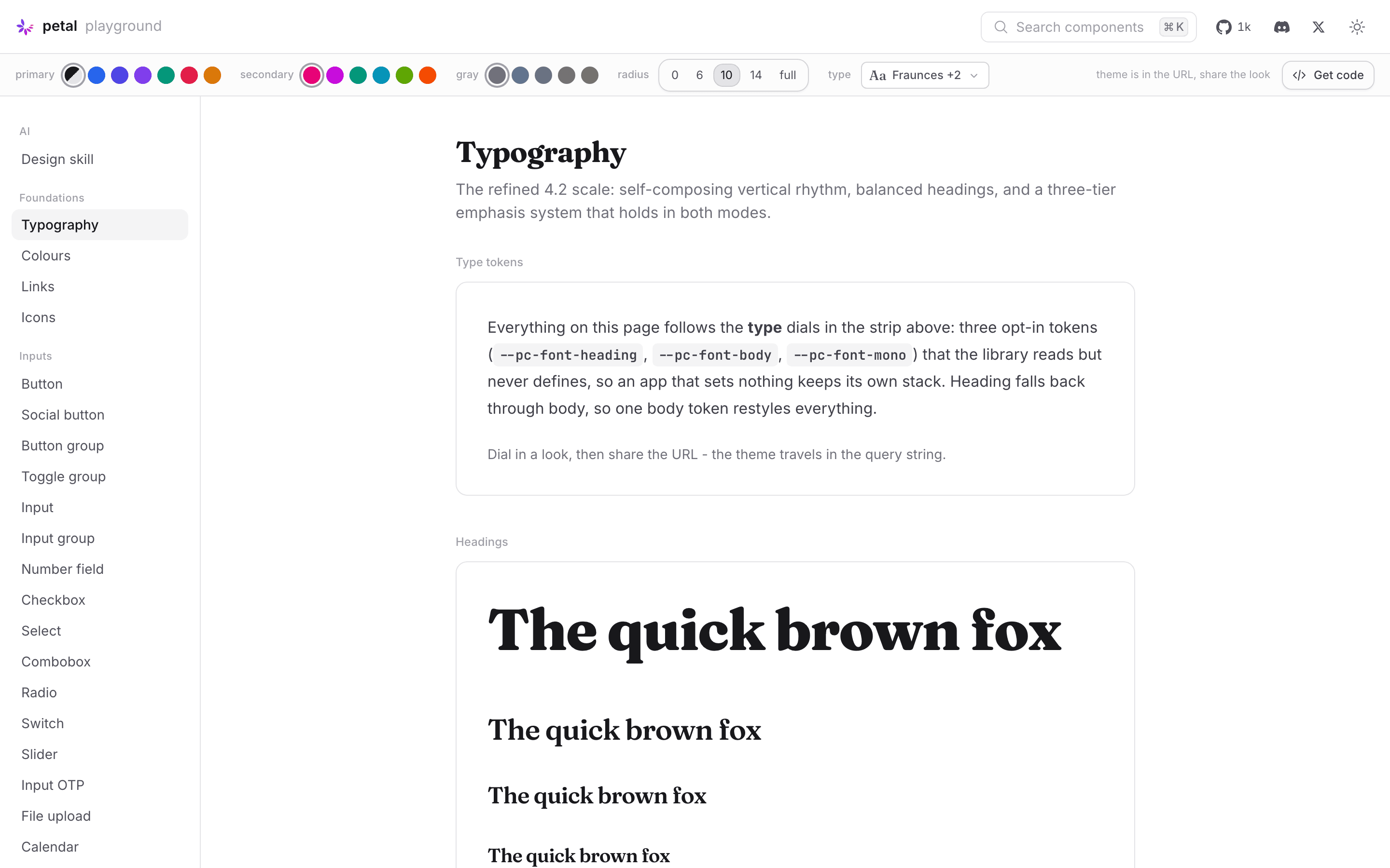
The Typography page with Fraunces for headings, Inter for body and JetBrains Mono for code, all dialed in from the strip at the top.
The playground grew a third dial group for it. Colour, radius, now type: a Typeset panel over a curated catalogue of 24 open-source faces, so you can pair a serif heading with a grotesk body and watch the whole library follow. The look travels in the URL like everything else, so a font pairing is a link you can send someone.
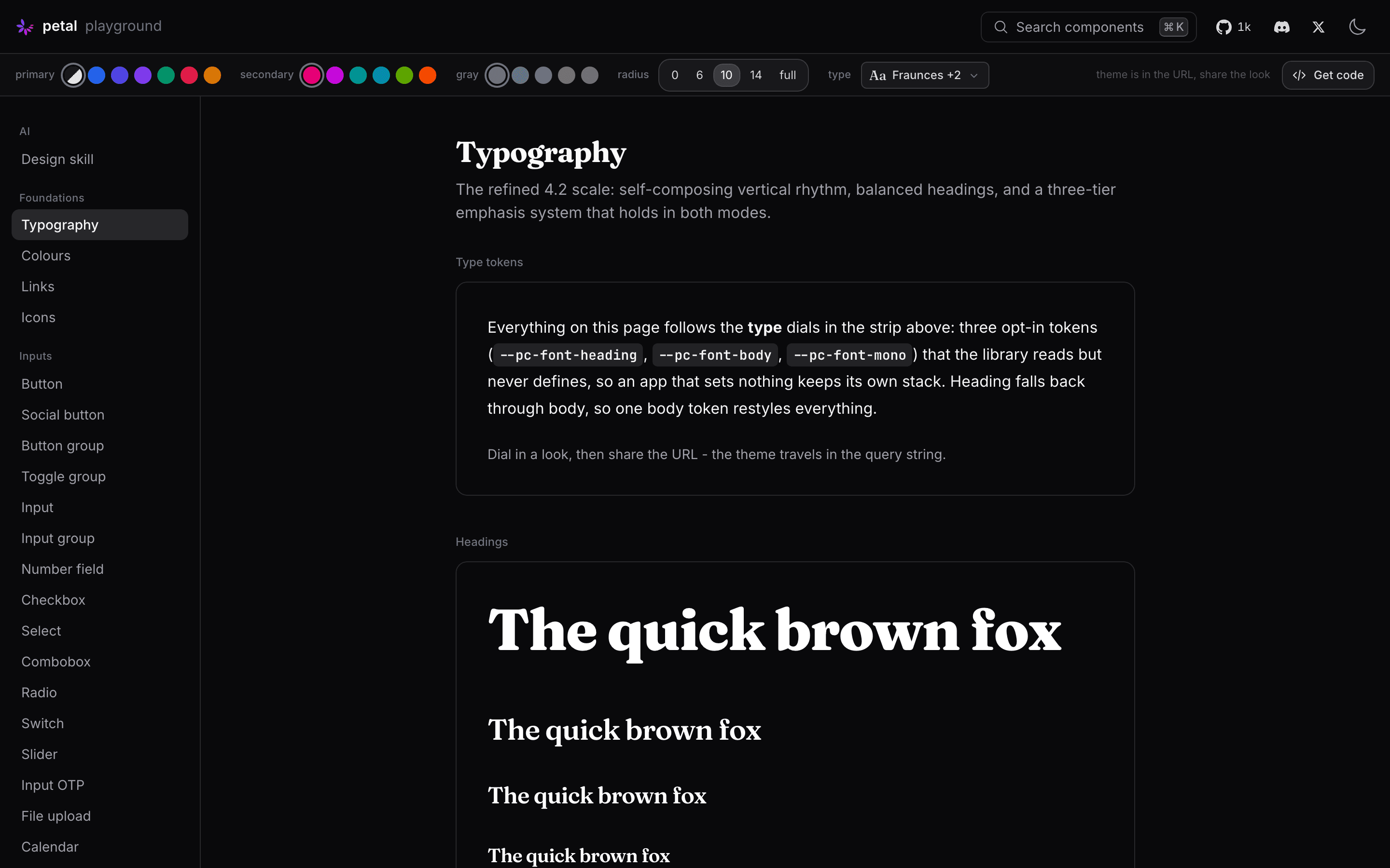
Same page in dark mode. Type tends to look heavier on a dark ground, so this is the view I check every pairing in.
A few of the decisions took longer than the code. The keyboard chip stays on the body face rather than mono, because a key cap is a label, not code. Chat headings stay on the message bubble's dense scale instead of jumping to the heading face. Numbers inside component chrome, badge counts, pagination, calendar days, get lining-nums, because plenty of lovely fonts default to old-style figures that sit at different heights, and inside a 20px chip that reads as a bug. And ECharts paints its labels into a canvas, where CSS can't reach, so the chart theme now copies the container's computed font and re-derives it when it changes. Set a font once and your axis labels follow too.
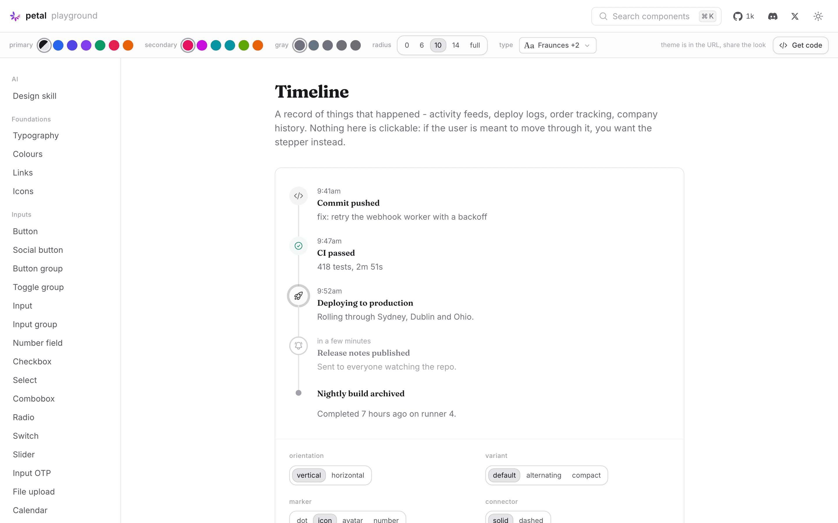
A component from the 4.15 release under the same three tokens. Nothing on this page knows about Fraunces. It just reads the token.
Get code
The dial strip had a problem I'd been ignoring. Once you'd found your look, getting it into a real project meant reading four docs pages. So the playground now has a Get code button that emits the whole start story for whatever you've dialed in: the mix.exs line, the CSS imports, the theme block for your colours and radius, the font files to self-host with their real weight ranges, and a prompt you can hand straight to your coding agent.
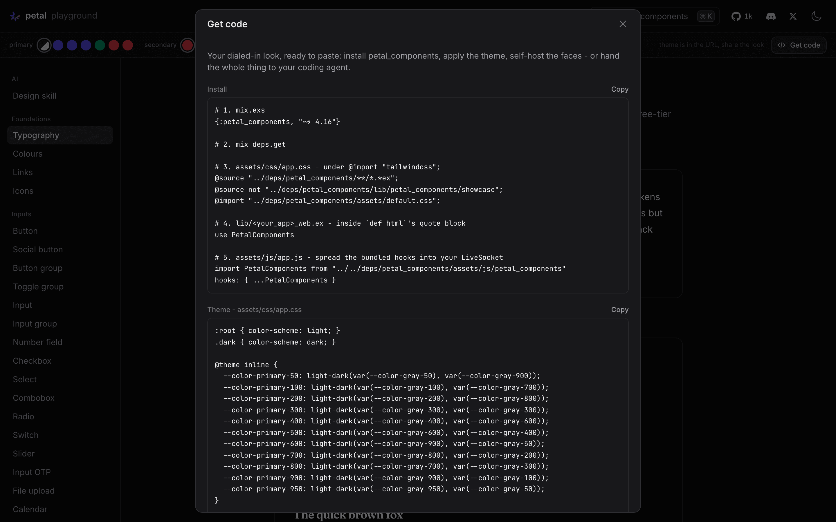
The Get code panel. Everything in it is generated from the current URL, so it's always the theme you're looking at.
That last part is the one I care about. More and more of the people installing Petal Components aren't typing the install steps themselves. An agent is. The prompt tells it exactly what to do, and the design decisions travel with it.
Twenty-one new components
Between those two posts, 4.15.0 went out, and it's the biggest release we've done. Twenty-one new component modules: a sidebar family for the app shell, a tree view, a calendar and a date picker, a number field, a rebuilt slider, drag-to-reorder sortable lists, file upload drop zones, an alert dialog built on the native <dialog> element, resizable split panes, a timeline, a context menu, a hover card, scroll areas and a scrollspy, a filter bar, an empty state, plus the small ones every app ends up hand-rolling: kbd, separator, collapsible and qr_code.
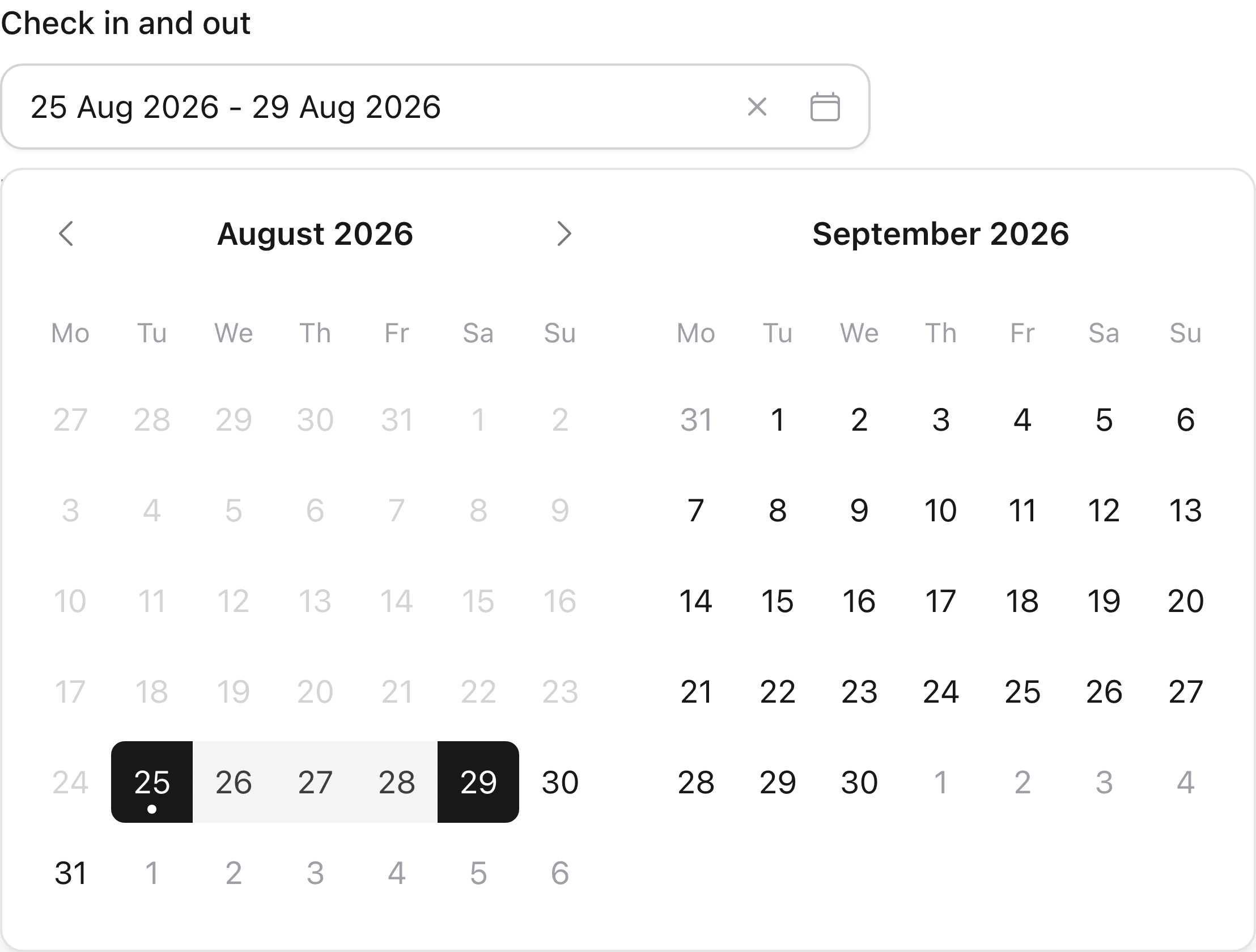
The date picker in range mode. Type a date and the calendar pages to it as you type. The form posts ISO 8601 either way.
The date picker is the one I'm most pleased with. Most libraries skip the text input and make you click through months. Ours is typed-first: type "14 Mar 2027" and the calendar follows as the year lands, Enter commits and closes, and a hidden input posts ISO 8601 regardless of the display format. It's built on Elixir's own Date, so there's no date dependency and no timezone guessing.
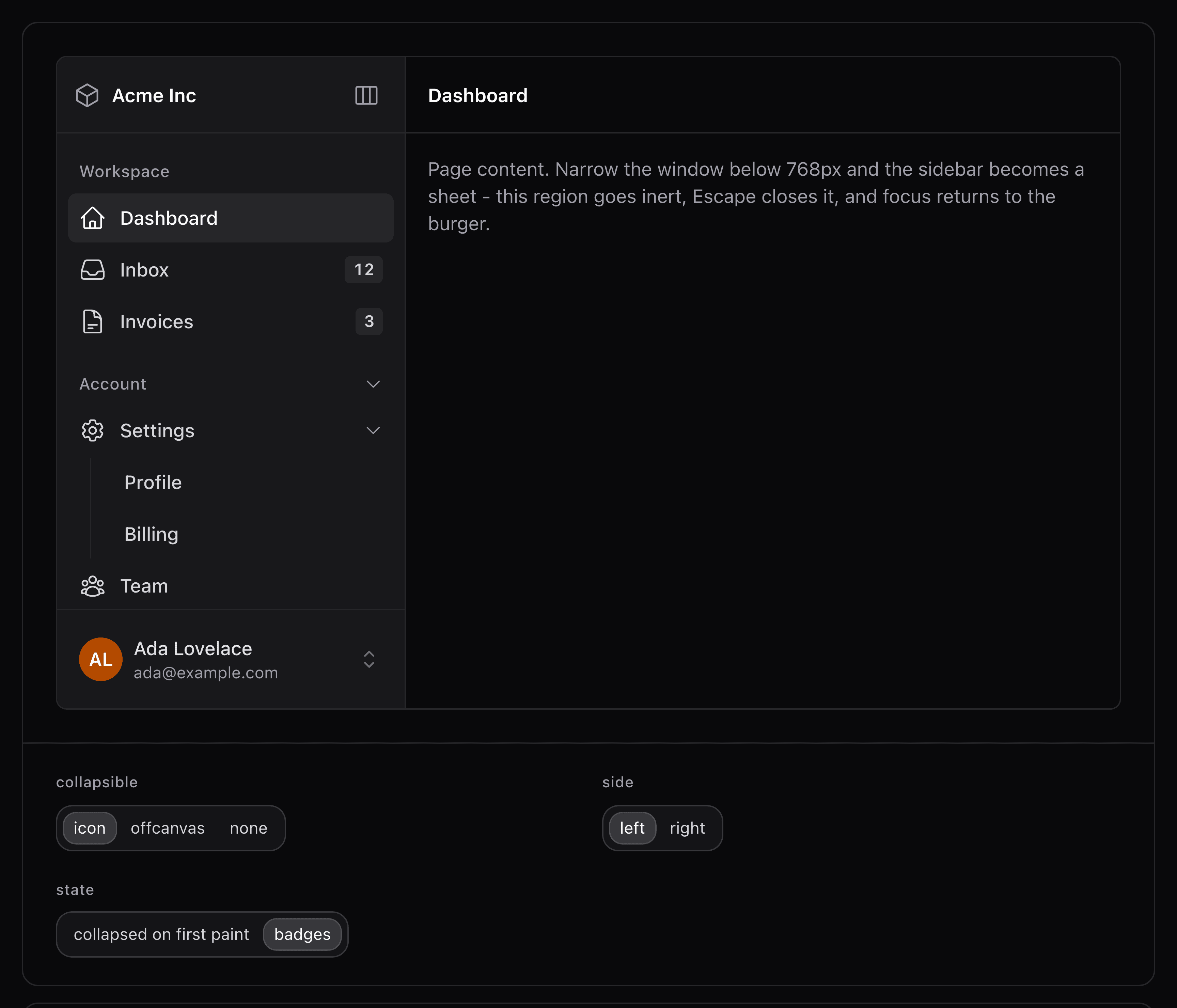
The sidebar family in dark mode. Collapse is CSS-first, so there's no hook and no round trip to the server.
The sidebar is called sidebar_nav on purpose. use PetalComponents imports every component into your module, and a hand-rolled def sidebar is the most common helper in Phoenix layout modules. The one name in the family that could collide is the one that doesn't exist.
The chat family grew up in the same release: tool call panels that render the whole lifecycle of a call as it streams, a questionnaire component for structured human-in-the-loop input, attachments in the composer, and inline citations for RAG answers that survive streaming without a hook fighting the DOM.
Petal Design, a skill for AI agents
This is the thing I've been chewing on for months. An agent with our MCP server can look up every attribute of every component and still produce a page that looks like three different apps. Schemas don't carry taste. Which gray is the gray. What dark mode chrome should be made of. When to reach for a component instead of raw Tailwind.
So we shipped petal-design, an agent skill that carries the design system itself. It's nine markdown files and zero code: the doctrine, a neutral gray dial, a translucent dark-mode material, one radius token, one focus recipe, plus a bundled schema snapshot for when the MCP isn't connected. It loads itself only when the agent is doing UI work.
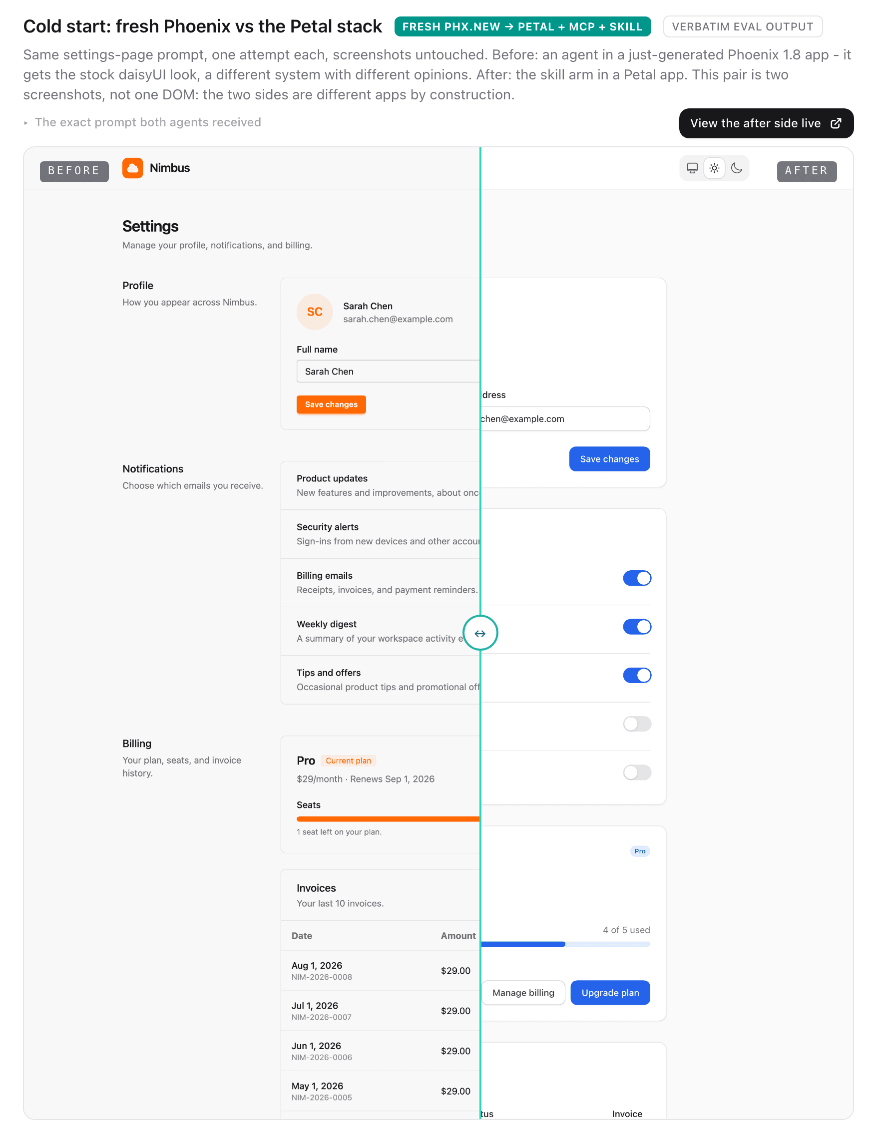
Same prompt, one attempt each, screenshots untouched. Left is a fresh Phoenix app with an agent doing its best. Right is the Petal stack: components, MCP and skill. You can drag the divider on the live page.
We measured it rather than promising it. Three arms, fixed tasks, one attempt each, outputs published verbatim, including the tasks where the skill made no difference. The honest finding: with a strong model inside an existing Petal app, schema access alone gets component choice right. The gap is the styling of the custom markup in between. Asked to add dark mode to a card, the MCP-only run mechanically inverts to opaque gray-800 panels. The skill run lands our actual dark material, translucent gray-400 surfaces with hairline borders. Both outputs are published unedited on the Petal Design page.
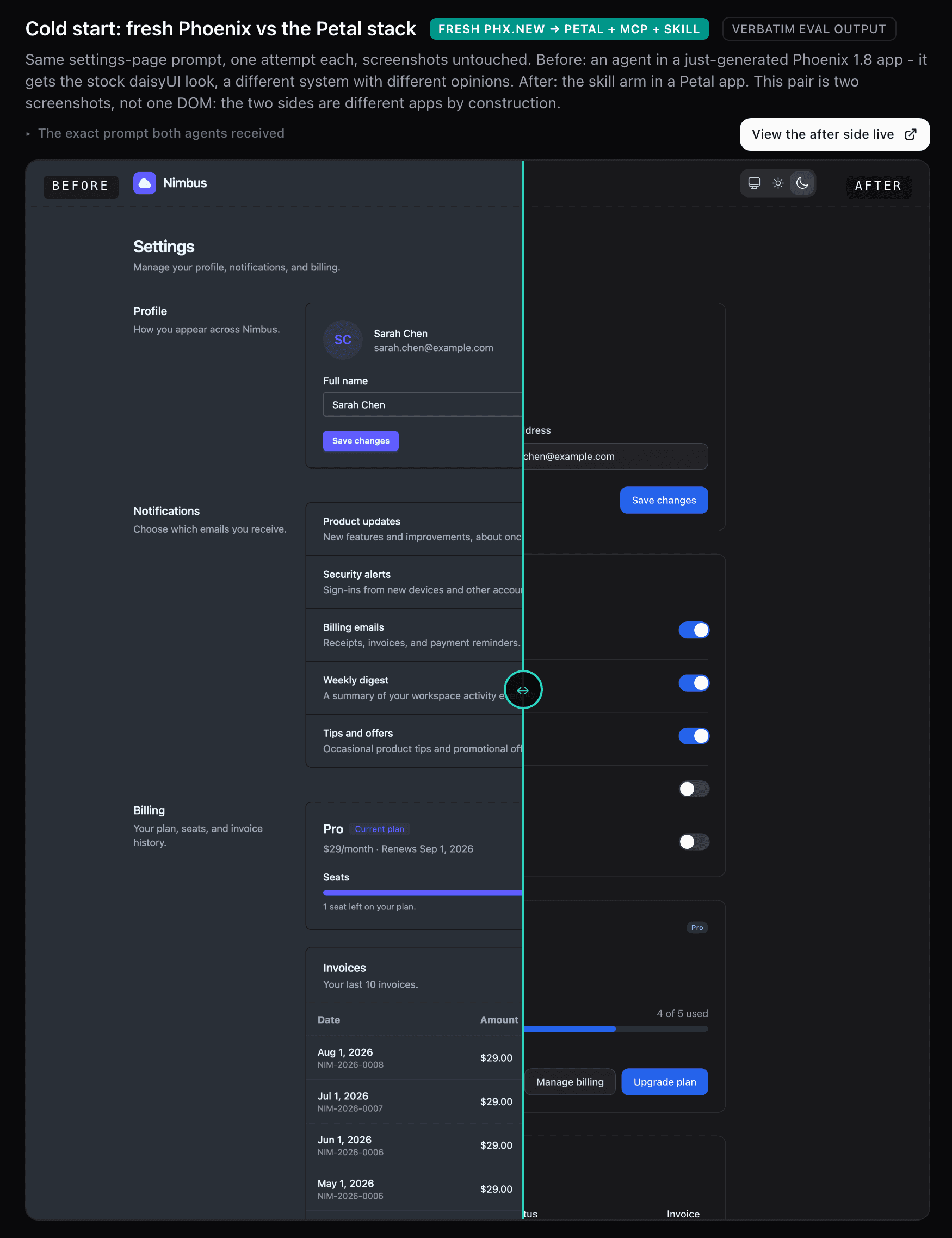
The same pair in dark mode, which is where the difference between the two arms is widest.
Install is two commands in Claude Code:
claude plugin marketplace add petalframework/petal_components
claude plugin install petal-design
Or copy the folder straight out of the package into your project's skills. MIT, like everything else. Petal Pro picks all of this up in its next release.
What I relearned this time
Last time it was z-index. This time it was maps. A golden test that pins a dropdown's HTML went red on a branch nobody had touched. The panel's attributes came from a map, and the order they came out in turned out not to be stable across clean rebuilds, so style and phx-hook could swap places on their own. The fix was boring, a keyword list rendered in the order written, and we swept every other helper that splats a map into a tag while we were in there. Byte-stable HTML across builds is something you have to decide to have.
Go and have a play at playground.petal.build. Dial in a pairing, hit Get code, and tell me what your agent builds with it.