
The storefront should be the demo
We relaunched petal.build. The old homepage had quietly become a Petal Pro sales page, which buried the part most people actually turn up for: a free component library, a playground, an MCP server and a design skill that together let an AI agent write Phoenix UI that looks like one product. The brief for the rebuild was easy to say and hard to do. Make the whole ecosystem feel like one thing, and make the site itself the proof.
Build it out of the thing it sells
The strongest way to prove a component library is any good is to build your own marketing site with it. So we did. Almost every card on the new page is a real Petal component, not a bespoke div dressed up for the camera. That's a constraint with teeth: the moment the storefront needs hand-rolled CSS to look presentable, you've admitted the library isn't enough. We held the line, and the page passes the same design-system test we ask of everyone else.
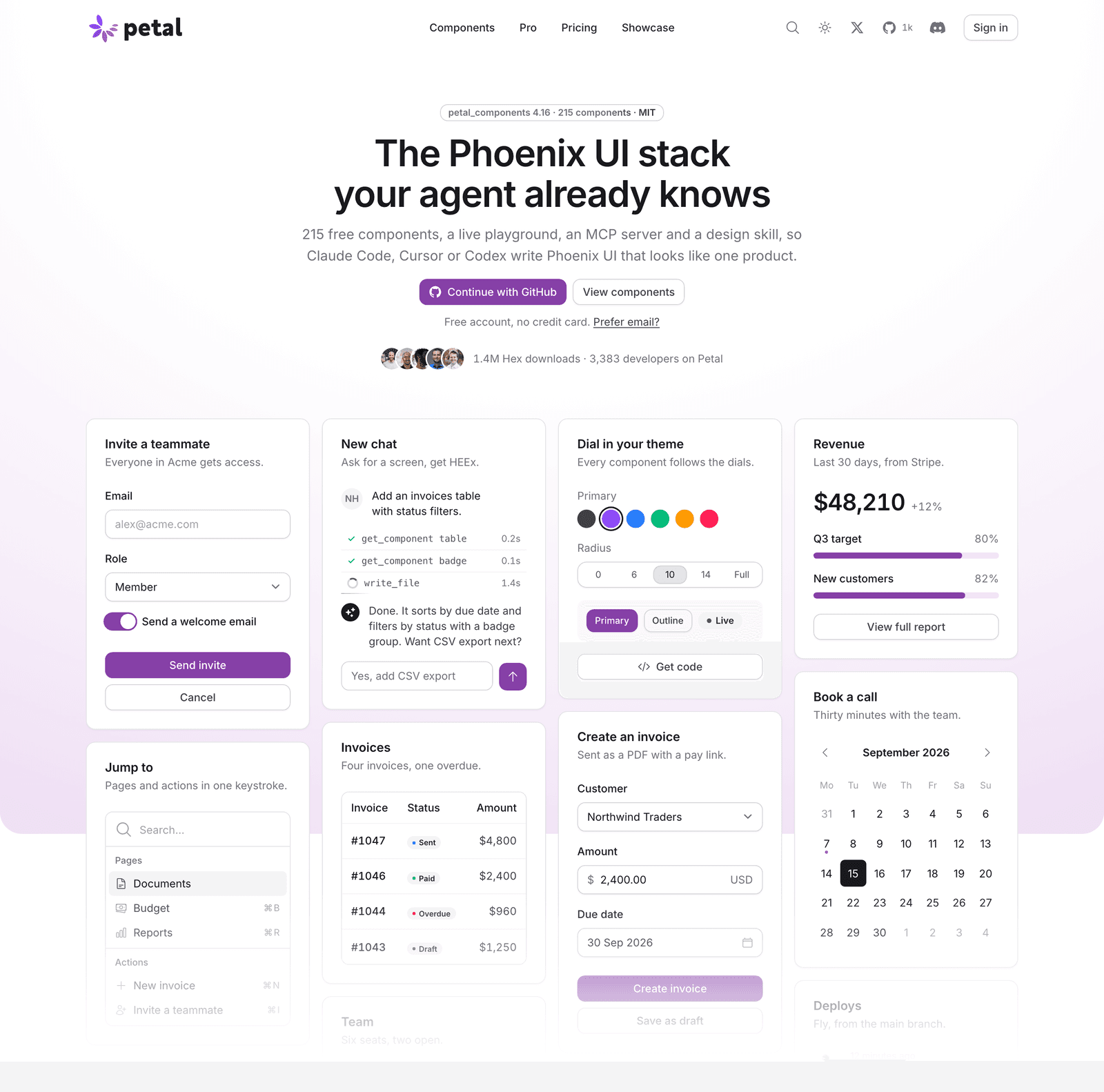
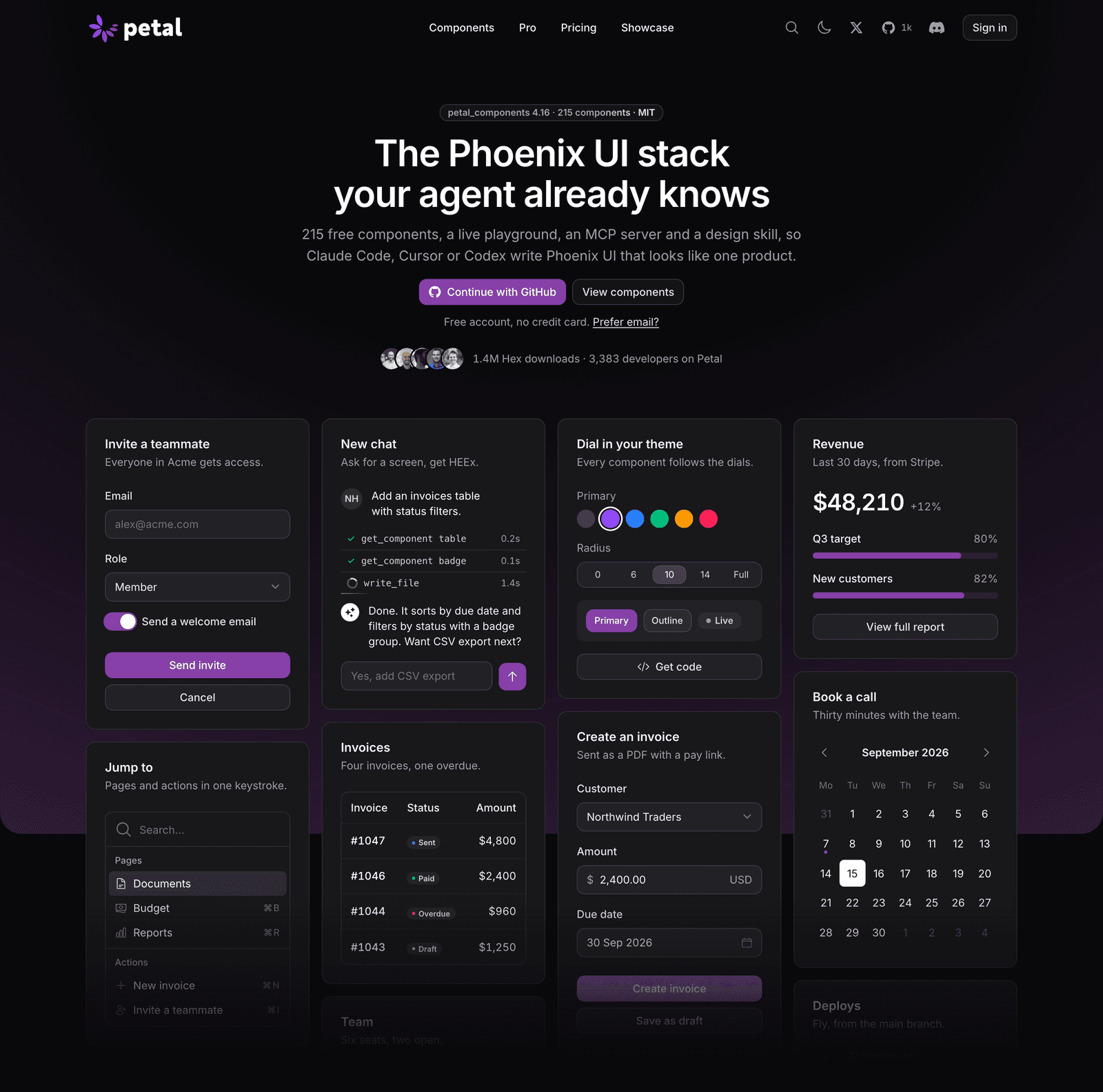
The same hero in light and dark. Neither is an afterthought.
Cohesion is a few decisions, repeated
The whole site themes off the same dials as the components: one brand accent, everything else neutral, one dark ground. The violet only ever lands on the primary action, so your eye always knows where the one real button is. And both colour schemes are designed, not one inverted from the other. Dark mode that's just a filter thrown over the light design always shows, and it's the quickest way to make something feel cheap.
Show the ecosystem as one thing
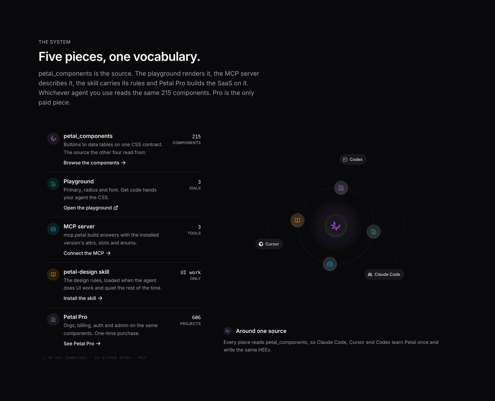
Five pieces, one vocabulary. petal_components is the source. The playground renders it, the MCP server describes it, the design skill carries its rules, and Petal Pro is the SaaS built on top. The section that makes it land is a diagram: the components at the centre, the four surfaces orbiting close, and the coding agents on a slower ring further out. Whichever agent you reach for, it reads the same components and writes the same HEEx. A picture says that faster than a paragraph can.
Receipts, not adjectives
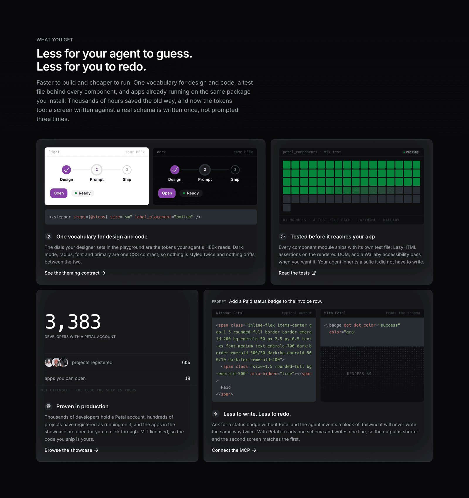
There's a copy test that fails the build if the word "world-class" ever creeps in. Instead of claiming the components are solid, the page shows a map with a square for every shipped module and every one tested. Instead of "loved by developers," it shows the real count, the real number of projects, the licence. And instead of "your agent will write clean code," it runs the same prompt with and without Petal, side by side, and lets you read the difference. Every number is pulled at runtime, so nothing on the page can quietly drift out of date.
The motion is studied, not sprinkled on
The animation, the beams tracing the install steps, the orbit, the ripple behind the closing call to action, was worked out frame by frame rather than pulled off a shelf. It came with a genuinely nasty lesson too. An entrance animation that starts at opacity zero can never be an element's default state, because a hidden or backgrounded tab doesn't advance animation frames. Our own screenshots came out black for a day before that clicked. The reveal has to be additive, applied only once the page is actually on screen. The last ten percent, taxing me again.
A ladder, not three cards fighting
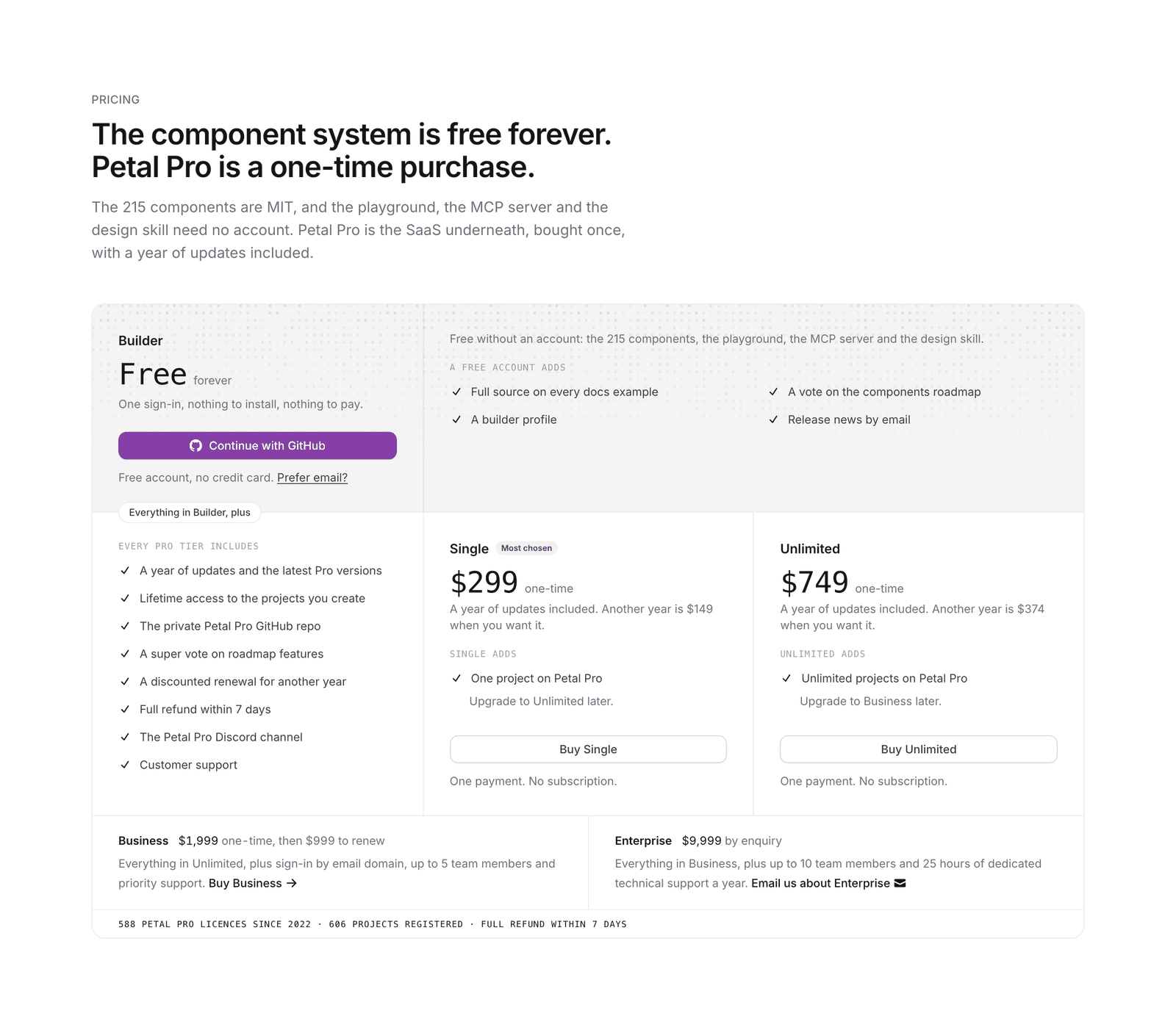
The old pricing was three equal Pro cards. The new version is a ladder you read top to bottom: the free Builder account at the base, the shared Pro benefits, then Single, Unlimited, and Business and Enterprise along the foot. One deliberate small thing: the free tier is called Builder, not Hobby. A free tier shouldn't quietly tell a lead engineer the library is a toy.
A storefront is a design problem wearing a marketing problem's clothes. The one trick, if there is one, is that when you build it out of the same parts you're selling, it can't really lie about them.