
Designing Doseloop dark-mode-first
Doseloop is a place to track your supplement stack and daily routine, see what people like Huberman and Bryan Johnson actually take, and get AI to read your bloodwork and suggest what to change. The idea is dense. The interface could not afford to be.
Most health apps make one of two mistakes. They look like a spreadsheet, all rows and numbers, or they look like a hospital, cold and clinical. I wanted Doseloop to feel like something you'd actually want to open at 6am, so I designed it dark-mode-first and worked back from there.
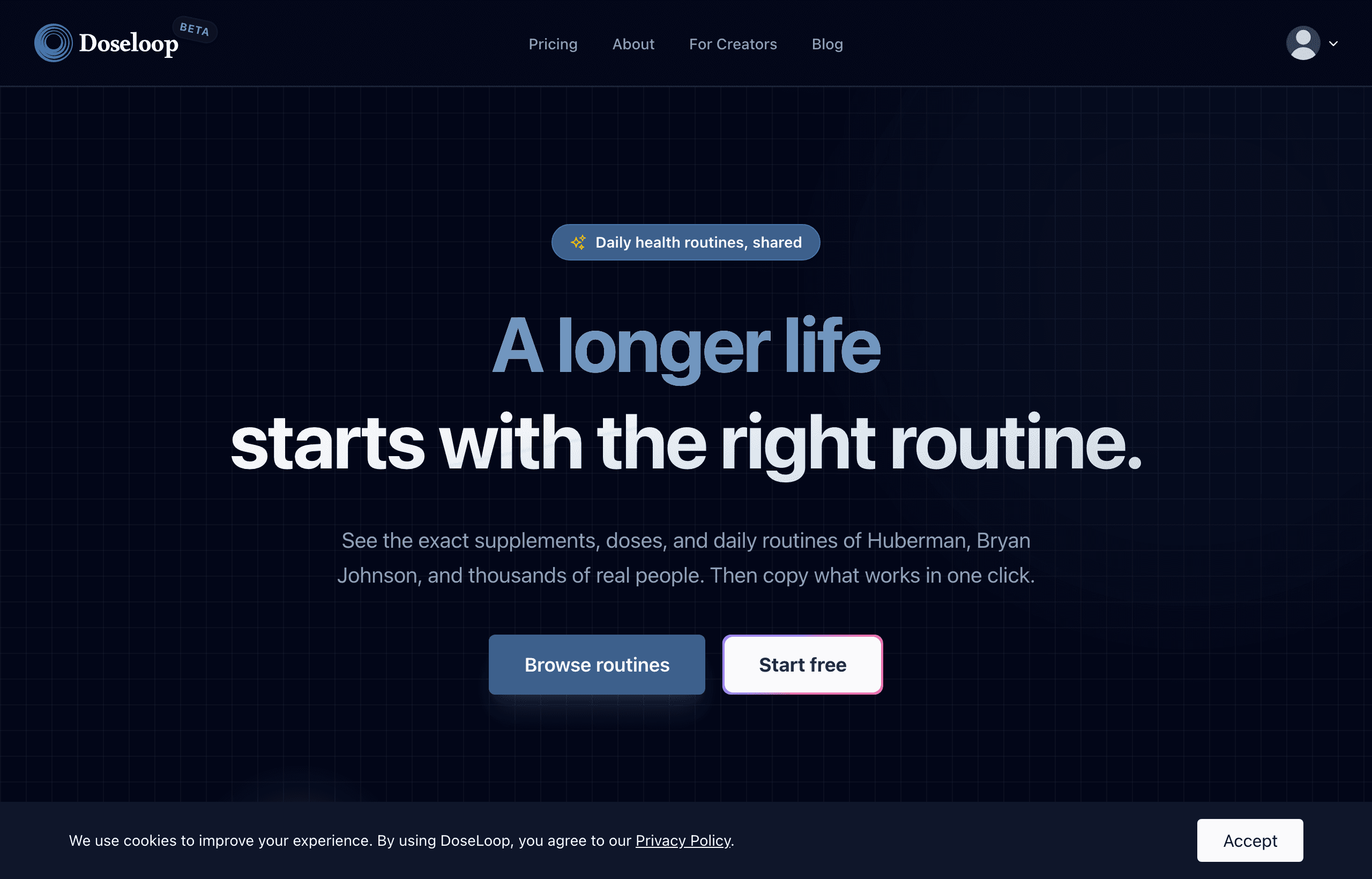
Designing dark-first changes how you think. You stop leaning on borders and shadows to separate things and start using space and contrast instead. Colour has to be deliberate, because a bright accent on a dark background carries far more weight than it does on white. Get it wrong and the whole thing reads like a gamer's dashboard. Get it right and it feels calm and premium, which is exactly the register a health app needs.
This is the part of building I enjoy most, and honestly the part I'm best at. The front-end. The difference between an interface that works and one that feels finished lives in a hundred small decisions: how a number animates when it updates, what the empty state says before you've added anything, whether a loading state reassures you or makes you anxious. None of it shows up in a feature list. All of it shows up in how the thing feels under your hands.
The AI in Doseloop is the headline. The reason people stay is quieter. It's that tracking your health in it doesn't feel like a chore. That was a design problem before it was a technical one, and it's the sort of problem I'll happily spend a week getting right.