
Building a live playground for Petal Components
For years the way you explored Petal Components was a long scrolling page on a Fly demo. It did the job, but it was a museum. You looked, you didn't touch.
I wanted something you could actually play with. So we built a proper playground.
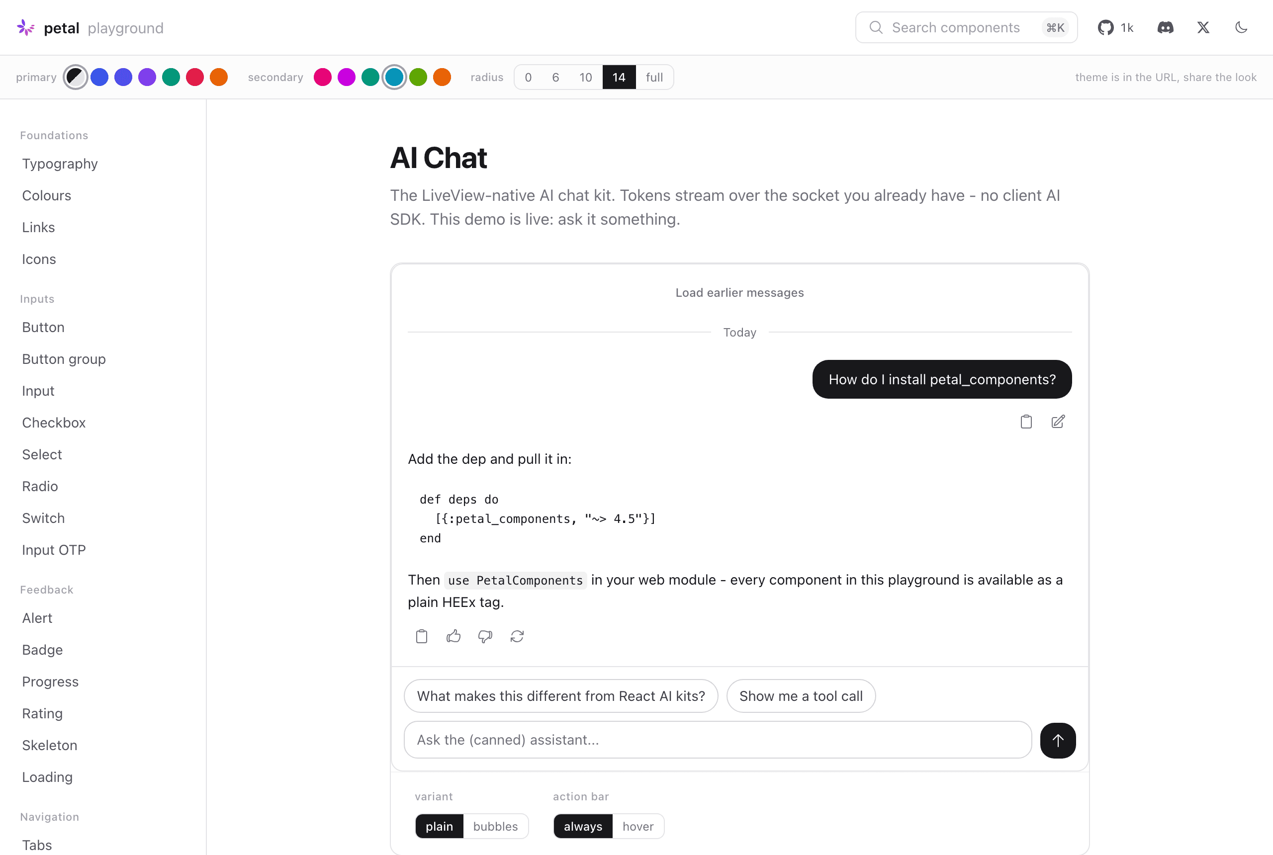
The AI Chat component in the playground. That demo is live, it really streams.
Two things make it different from a normal component gallery.
First, the theme lives in the URL. There are dials across the top for your primary colour, your secondary colour, and your corner radius, and every component on the page restyles the instant you touch them. Find a look you like and the URL already holds it, so you can paste the link to a teammate and they land on exactly what you saw. The address bar is the share button.
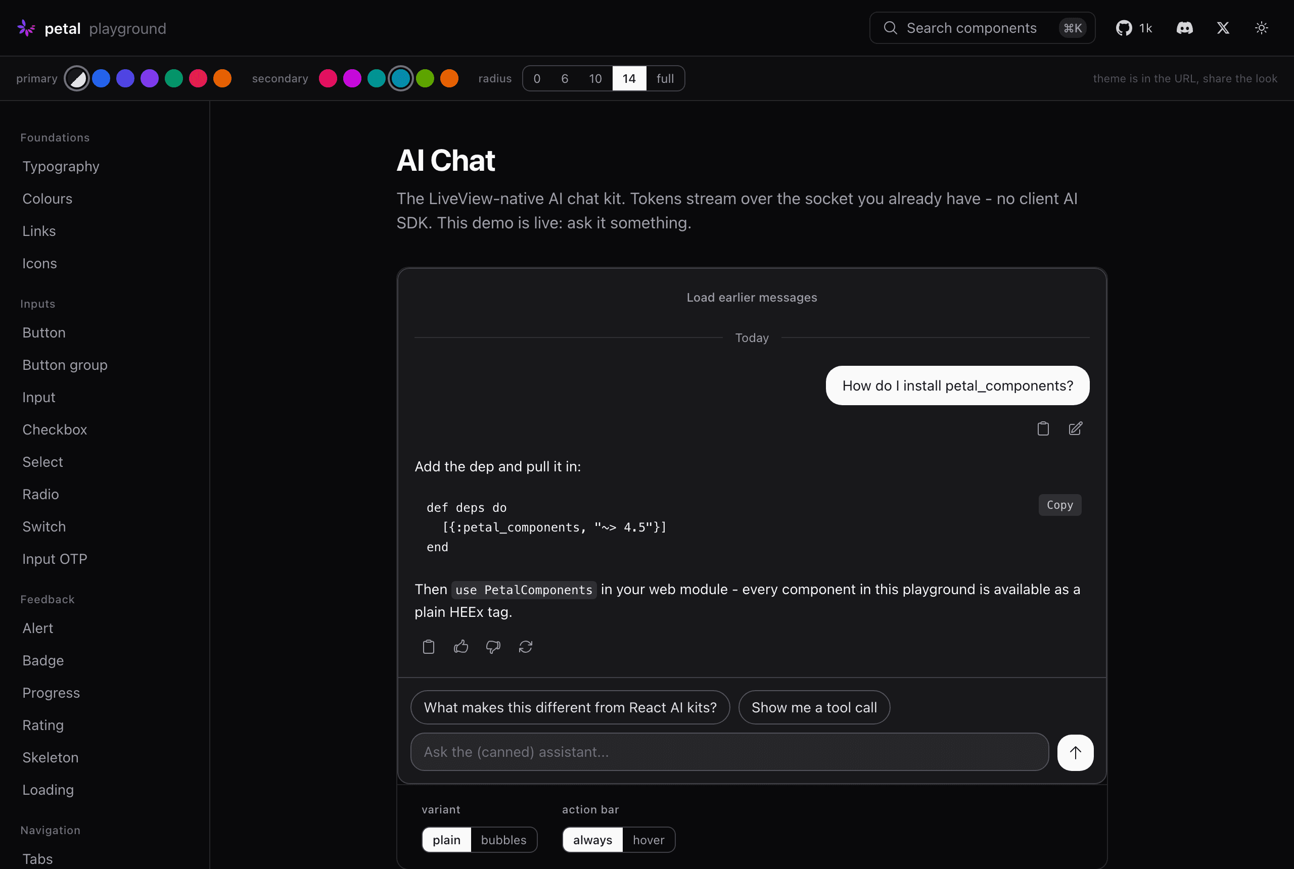
Same component, dark mode, flipped from the URL. Everything ships light and dark from day one.
Second, everything is live. This is Phoenix LiveView, not a screenshot tool, so the components behave the way they will in your app. The AI Chat kit streams tokens over the socket. The selects open, the buttons show their loading states, the forms validate. What you see is the real component doing its real thing.
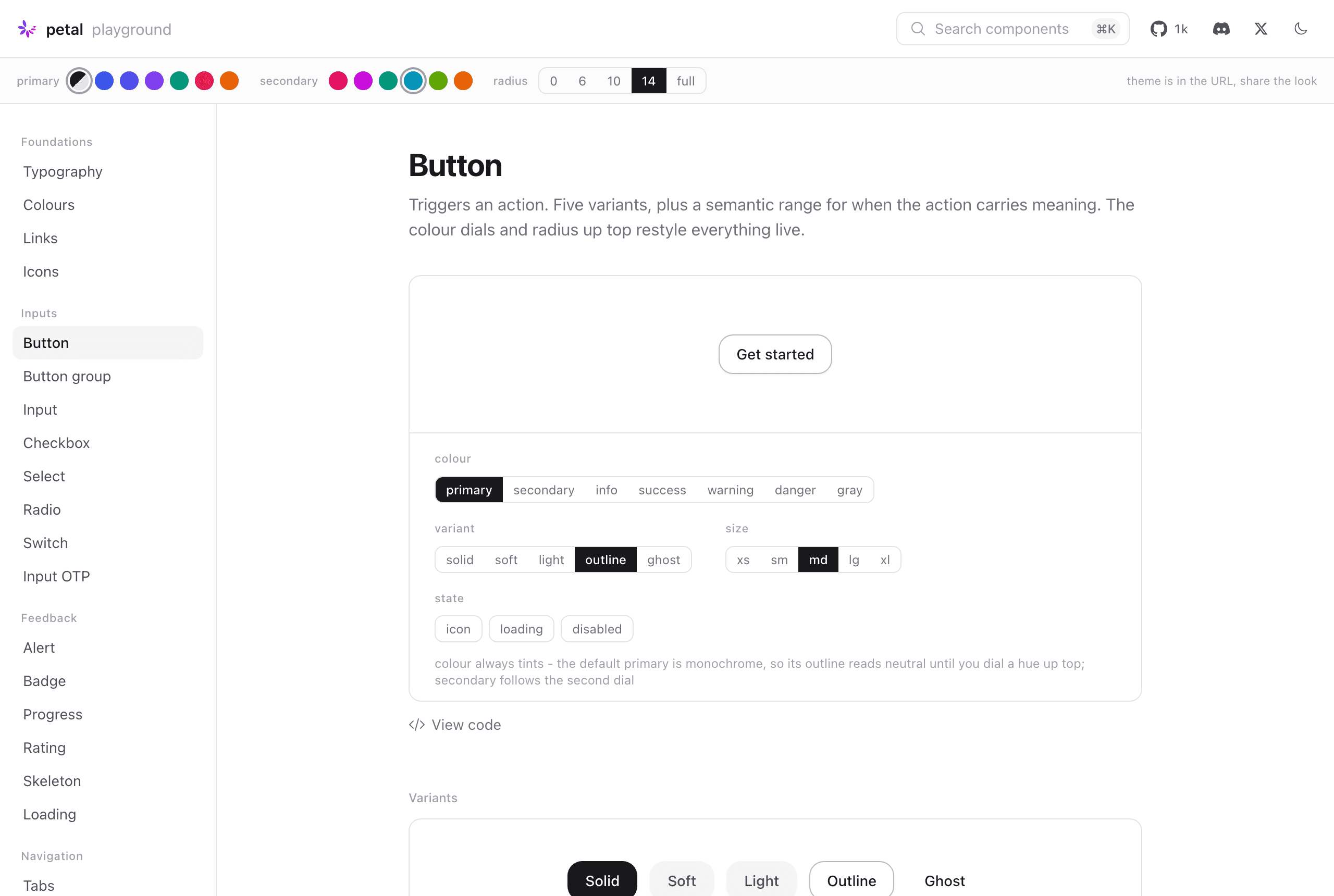
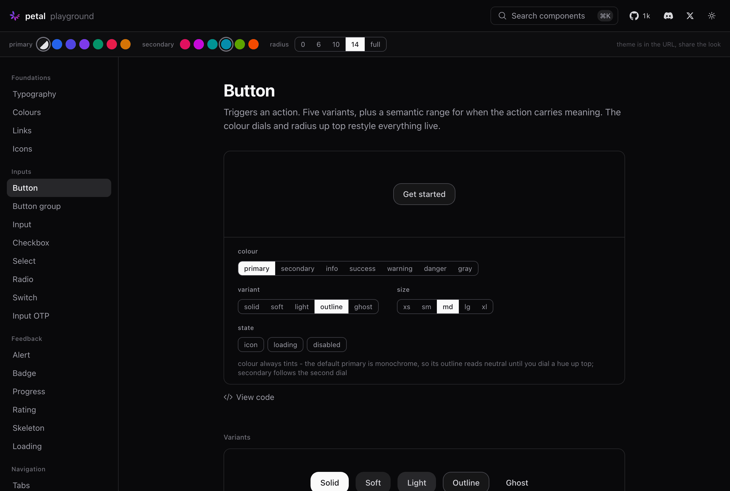
Every component has its own controls. Dial a variant, a size, a state, then hit "View code" and copy the exact HEEx.
Under the hood it runs on phoenix_playground, which lets us boot the whole thing from a single script with no app scaffolding around it. That keeps it honest: the playground pulls in petal_components the same way your project would, so there is no special demo version quietly drifting from what ships on Hex.
My favourite thing is watching someone dial their brand colour in and realise the entire library just became theirs. No fork, no overrides, no fighting the CSS. That was always the promise of Petal Components. The playground is the first place you can feel it in about ten seconds.
Go and have a play at playground.petal.build. Pick a colour, bump the radius, break something. Then tell me what you'd theme differently.