
Border plasma, and a busy month on Petal Components
When the playground went out we were on Petal Components 4.5. A month later we're on 4.14. That's nine releases, most of them small, a few of them not. Here are the ones worth talking about.
Border plasma
The headline is a new effect. border_beam sends a single dot of light travelling around the edge of a card, which reads as motion crossing the screen. Border plasma does the opposite. It lights the whole ring at once, so the glow pools on the border and leaks softly onto the panel, pulling your eye without dragging it around.
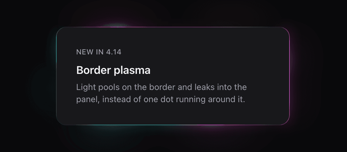
Getting it right was fiddlier than it looks, and it was worth doing properly because it's pure CSS with nothing to wire up. The glow has to hug the border ring and bloom inward without washing over the content, which means masking it to the ring with the padding-box trick. The breathing and the sweep both animate real values, so they ride registered custom properties rather than plain variables, because a plain custom property can't be animated smoothly. The default colours come off the theme rail instead of hard-coded hex, so a plasma picks up whatever brand a project has set without being told. And reduced motion is handled by never starting the animation and resting the ring at full brightness, because a dead border is a worse outcome than a still-lit one. Little of that is visible in the result, which is the point.
The combobox that fought back
A searchable select sounds simple and absolutely is not. Over a few releases the combobox grew up: multiple selection with removable chips, clearable, free-text and create-as-you-type, a trigger variant, rich option slots.
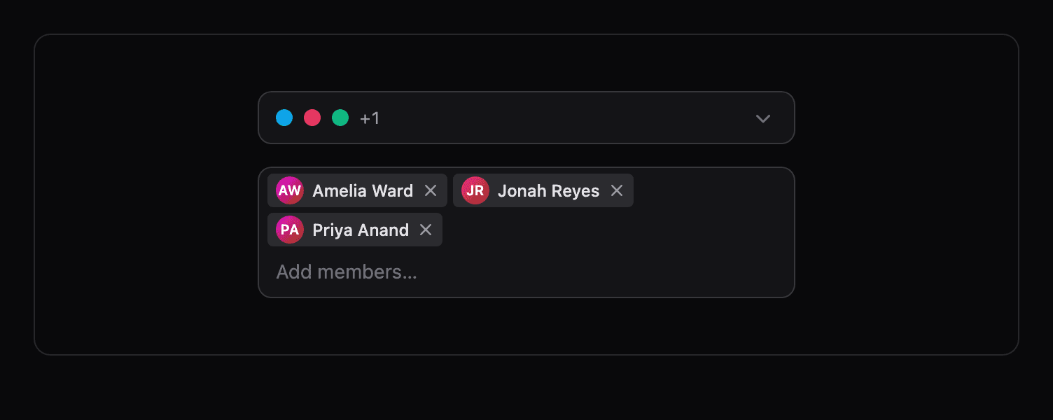
Most of the real work was accessibility, and most of that was invisible. The input carried no accessible name, so screen readers only had the placeholder. A required combobox could deadlock a form: the constraint lived on a hidden, inert select the browser couldn't focus or draw an error on, so submit failed silently with nothing announced. max_items was a visual cap only, so the keyboard still walked onto options it wouldn't let you pick. None of that shows up in a screenshot. All of it is the difference between a component you can ship and one you can't.
Data table, quietly getting serious
The data table picked up a proper state engine this month: filtering, sorting and pagination that actually hold together, with an in-memory engine to run against.
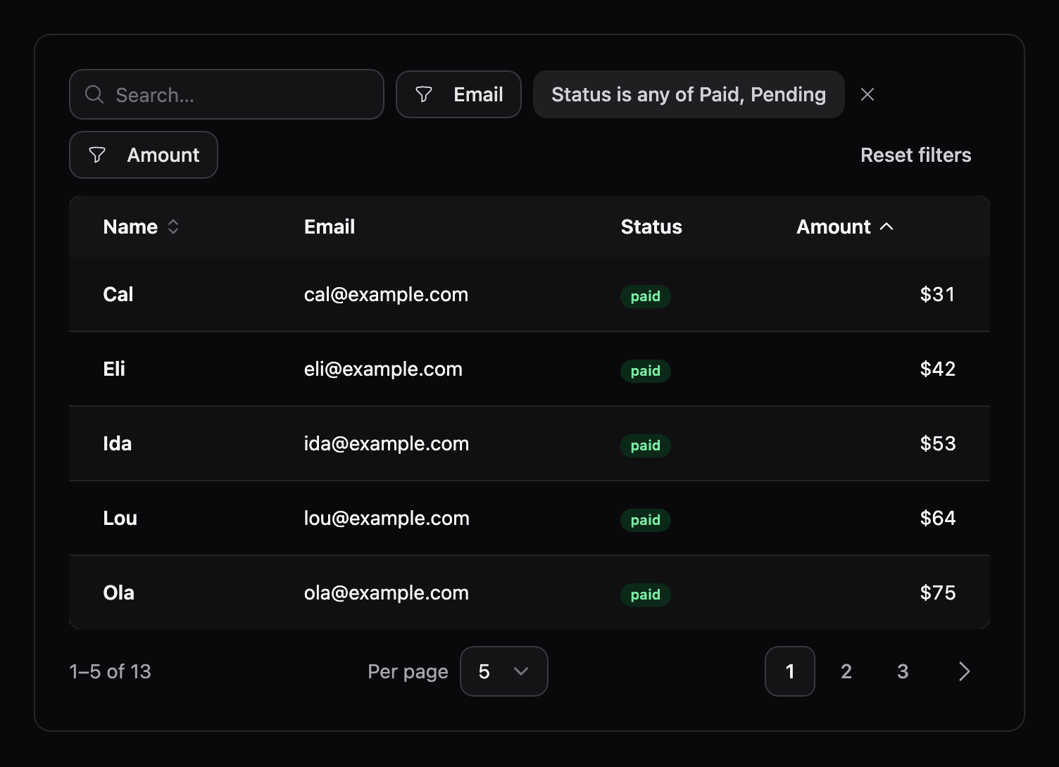
My favourite fix in it was the smallest. Decimal columns, which is what every money value in an Ecto app actually is, couldn't be filtered and sorted wrong, ordering -10.00 as if it were the largest number in the table. The kind of bug that's invisible until it's in front of a customer looking at their invoices.
The z-index lesson I relearned
The most interesting thing we found this month wasn't a feature, it was a slide over that refused to sit on top of anything.
On the docs pages, opening a slide over left the sidebar and navbar painted right over it. The obvious fix is to raise the overlay's z-index, and it does nothing. The overlay was already at a high z-index. The problem was an innocent z-10 on a wrapper further up the tree, which quietly created a new stacking context and trapped the overlay inside it. A z-index only competes with its siblings in its own stacking context, so our overlay at z-50, or z-9999, was still losing to a sidebar at z-20 that lived one context up. Removing that one stray z-10 fixed it instantly.
While we were in there we caught a sibling bug: opening a modal or slide over nudged the layout around it by eight pixels, because the root element was an in-flow zero-size div that became a real flex item the moment it was revealed. Making the root fixed took it out of flow entirely.
Neither is glamorous. Both are the sort of thing that quietly erodes trust in a UI library if you let them sit. A month of this, mostly, is what a component library actually is: a long tail of small, invisible correctness, with the occasional glowing border on top.